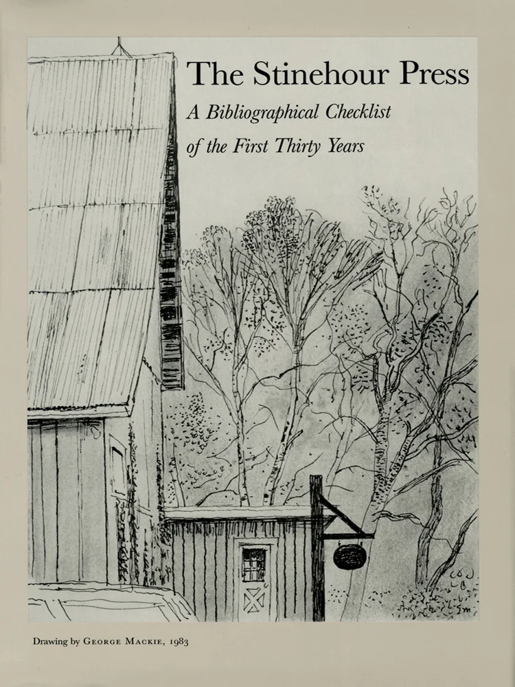
Items from the Bibliographical Checklist of the First Thirty Years


The Stinehour Press 
A Bibliographical Checklist of the First Thirty Years

Selected and Compiled by David Farrell
Published by Meriden-Stinehour Press, Lunenburg, Vermont, 1988

Available for purchase from the Shop

 
No. 1

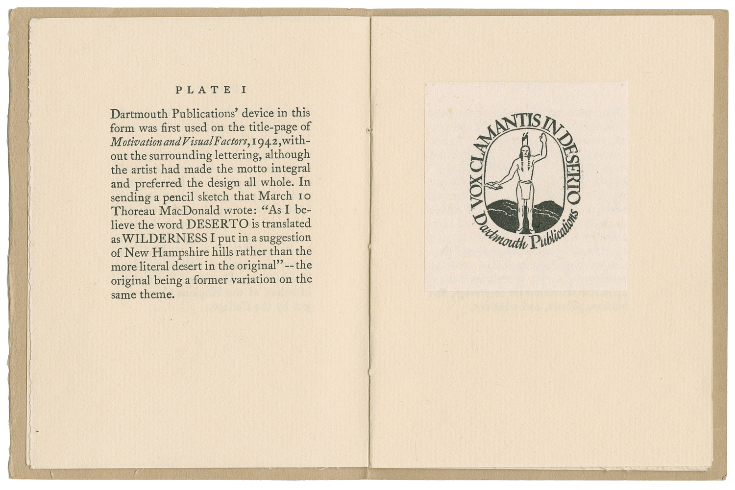
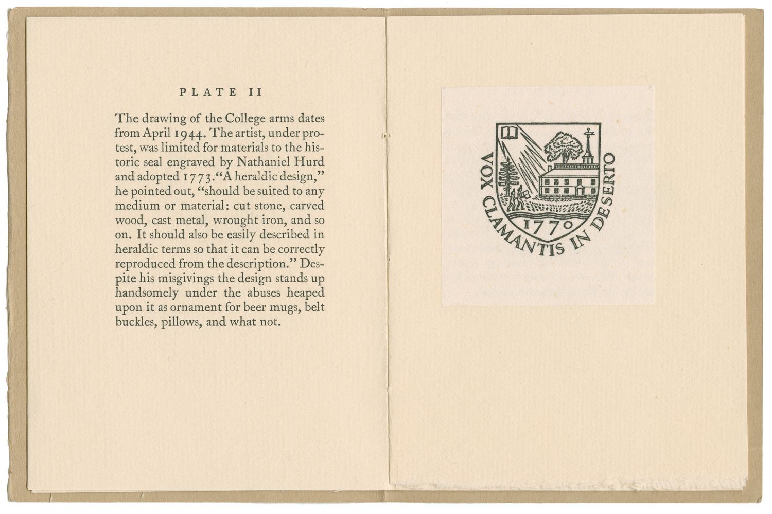
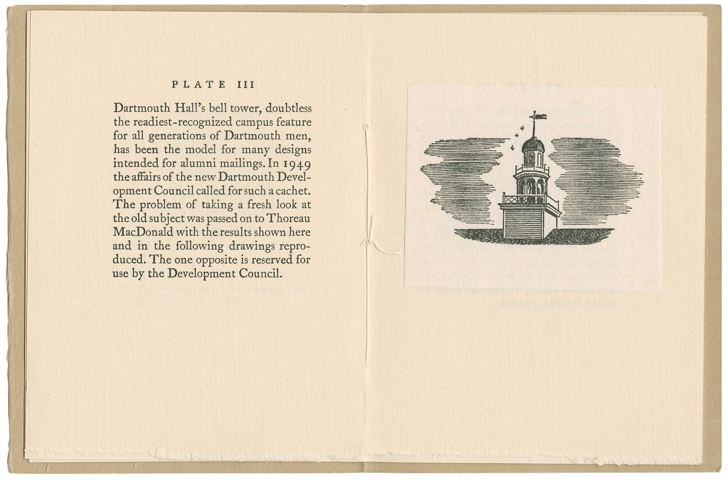
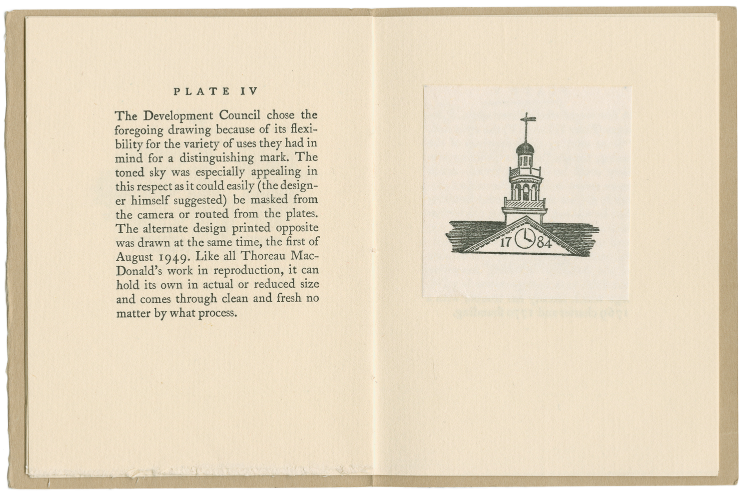
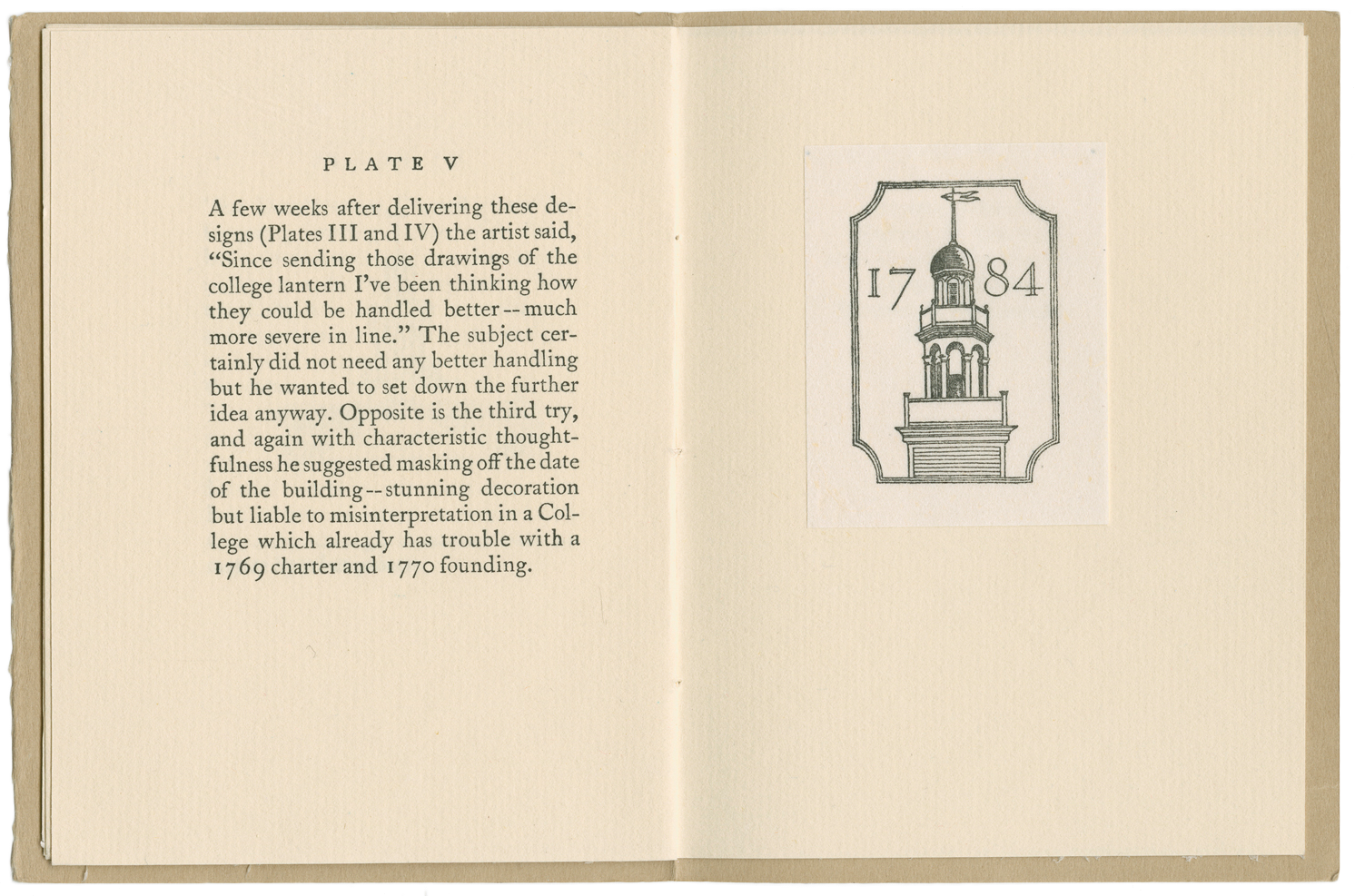
Thoreau MacDonald's Drawings for Dartmouth
With notes by Ray Nash


Designed and printed by Roderick D. Stinehour at the Graphic Arts Workshop,
Dartmouth College, May 1950

4.75 x 3.5 inches; sixteen pages including five tipped-in illustrations on Japanese tissue. Two hundred copies; untrimmed and handsewn by Elizabeth Stinehour into a light brown paper cover.

This is the first entry inThe Stinehour Press, A Bibliographical Checklist of the First Thirty Years, which describes 1,006 publications printed at The Stinehour Press from 1950 to 1979. 


No. 47

The Stuyvesant Staircase, Ayrault House, Newport. Privately printed, 1956.

8 3/4 x 6 1/4 inches; 12 + [2] pages, illustrated with a collotype plate printed by the Meriden Gravure Company. 150 copies printed on untrimmed paper; handsewn into brown paper cover. Designed by Roderick Stinehour. The pattern paper used to wrap the cover was designed by Elizabeth Friedländer (1903 - 1984), who designed a number of patterned papers for the Cuwren Press in the late 1940’s.


No. 53


The Great Stone Face  by Nathaniel Hawthorne

Foreward by Stearns Morse, drawings by John Nash. Printed and published by The Stinehour Press in 1957.
Designed by Roderick Stinehour, forty-six pages, 5.375 x 7.5 inches.

Available for purchase from the Shop

No.  80

 
Stinehour_Press_Merry_Christmas_1958
 

A few Paragraphs on Printing inVermont... By Roland E. Robinson. Lunenburg, Vermont
The Stinehour Press, Christmas, 1958

Excerpt from Vermont:  A Study of Independence  (1897)

6 1/2 x 3 3/4 inches; 8 pages. 200 copies printed for friends of the Press; handsewn into printed blue paper cover.
 An early Christmas keepsake from the Stinehour Press. Envelope addressed by Rocky Stinehour. 


No. 205

Grand
By Tennessee Williams. New York, New York, House of Books, Ltd., 1964

First Edition. 7 3/4 x 5 1/4 inches; 34 pages. 300 copies signed by the author; bound in yellow cloth over boards.


No. 251

Jan Van Krimpen:  A Perspective on Type and Typography, by John Dreyfus. 
Printed for Gallery 303, New York, 1965

9 1/4 x 6 1/2 inches; 20 pages. 300 copies saddle wire stitched into white paper cover. First appeared in Printing and Graphic Arts, VII, 4 (1959); here printed for the Heritage of the Graphic Arts lecture series. Designed by Roderick Stinehour.


No. 320


The Country Mouse and the Town Mouse

Illustrated by Wenday Watson. Printed by The Stinehour Press in 1967 as a Christmas keepsake.
Designed by Edith McKeon, thirty-two pages, 4 x 6 inches.

Available for purchase from the Shop


No. 375

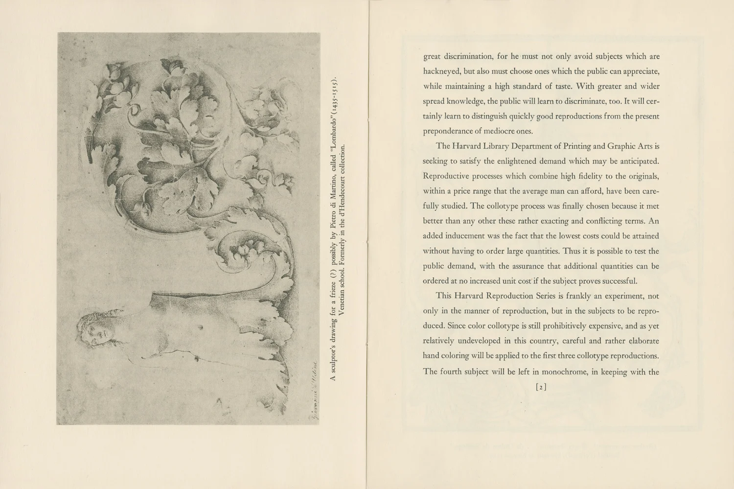
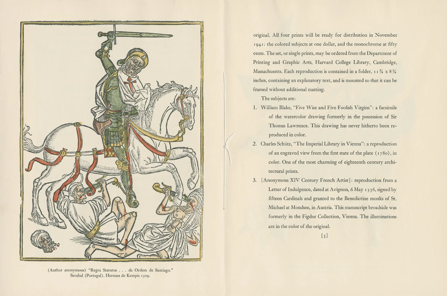
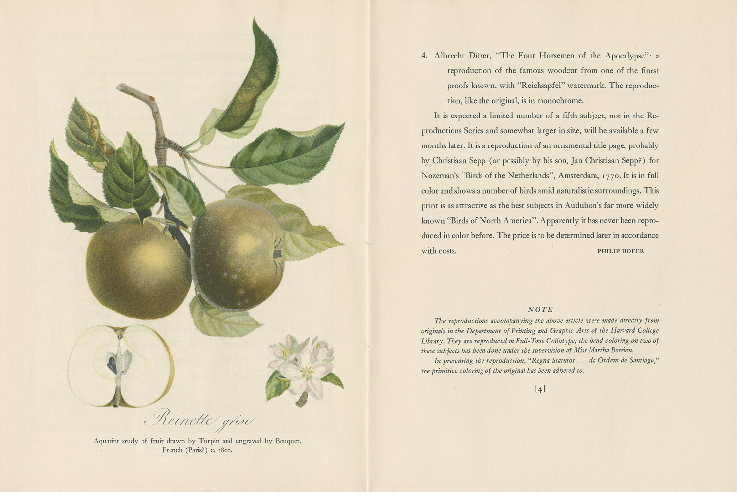
Philip Hofer as Author and Publisher

Introduction by Ray Nash. Cambridge, Massachusetts, Harvard College Library
Department of Printing and Graphic Arts, 1968

10 1/4 x 7 1/4 inches; 64+ [2] pages; illustrated; bibliography. 500 copies bound in printed gray paper and red quarter cloth over boards. Designed by Roderick Stinehour.


No. 570

The Visions of Mary

Edward Tyler with wood engravings by Gillian Tyler.

9 1/4 x 7 inches; 26 pages. 350 copies bound in beige paper over boards. Designed by Roderick Stinehour.
Lunenburg, Vermont; Privately printed, 1972.


A Bibliographical Checklist of the First Thirty Years is available for purchase in the Shop

Full-Tone Collotype by the Meriden Gravure Company

Reinette Grise, Collotype, Meriden Gravure Company

Full-Tone Collotype
For Scientific Reproduction

Supplement No. 15, 1940

The Reproduction Series of the Harvard Library
Department of Printing & Graphic Arts

8 3/8 x 11 1/4; twelve pages; hand sewn. Cover and text printed letterpress with three plates reproduced by collotype. Text by Philip Hofer, Harvard College Library. Three additional plates contained in a back pocket. Hand coloring on two of the plates carried out under the supervision of Miss Martha Berrien. 


The success of the Meriden Gravure Company was achieved through the superlative quality of its reproductions, realized by collotype, and particularly valued by its customers in the fields of the visual arts and sciences. In the 1930's they began publishing an elegant series of Supplements to promote what they termed the Full-Tone Collotype process. These were carefully considered works, some with text specially prepared by an author whose publications had been printed by Meriden Gravure, which allowed for commentary on the particularities of reproducing his or her originals by collotype. Each Supplement was completed with a different colored paper cover printed by letterpress, harmoniously coordinated ink colors, and included a selection of plates from current projects, tucked into a die-cut pocket on the back cover. 


   "Collotype as a method of reproduction was conceived as early as 1855, but it was not until the early 1870's that it became practical through the work of Earnest Edwards in England. The Meriden Gravure Company started printing by collotype in 1892, achieving successful results immediately. The process remained difficult however, and an extended period of experimentation ensued to develop new methods to improve upon it. A research and development laboratory was established which resolved inconsistencies due to haphazard production and in time perfected the process, first: in controlling the different elements entering into the printing process and second: in developing methods and equipment to successfully carry out the discoveries...The result is Full-Tone Collotype. 
     The original copy is photographed on a continuous tone negative and from this the collotype plate is made. Every detail that the camera records from the original is therefore transferred directly to the ultimate plate The full tone values of the original are retained.
     Inasmuch as the image on the plate is continuous tone there is no photo-mechanical screen to break up fine detail. Since the image is not broken up into separate dots of varying size, the same range of tone is in the plate as was in the negative made from the original copy. There is also a great advantage in that Full-Tone prints may be enlarged for study with a magnifying glass, bringing out more clearly the detail in reproduction.
     The process is intaglio, a special full-bodied printing ink being deposited in the depressed portions of the plate and lifted out as the paper comes in contact with the inked-up plate. The depressed portions of the plate vary in depth according to the tone values of the original. The transfer of the full depth of ink from this intaglio plate to the paper gives a fullness and third dimensional quality to the reproduction." --  excerpted from A General Description of the Full-Tone Collotype Process of Reproduction with Specimen Plates, The Meriden Gravure Company, Meriden, Connecticut, undated.

 
Meriden Gravure, decorative border

From time to time the Meriden Gravure Company plans to send to you additional specimens of plates from actual orders, produced by the Full-Tone Collotype Process. The variety of these samples will indicate the wide range of illustrative material which can be most satisfactorily reproduced in Full-Tone.

         -- 
 Note, from Supplement No. 1


Another example of Meriden Gravure collotype can be seen in
a keepsake designed by Stephen Stinehour found on the
Broadsides page.
The records of the Meriden Gravure Company were given to
Yale University by the Stinehour Press and are housed in the Beinecke Rare Book and Manuscript Library.